As website building and marketing experts, there’s nothing we love more than admiring gorgeous websites that gets results. Today, we’ve decided to share some of what we consider to be the best website designs of 2021. While they all have things in common, they also have a lot of unique qualities that lend themselves to the individuality of the practices they represent.
Let’s get to it! Below are several veterinary websites that, in our opinion, are doing lots of things right. You can check them out for yourself, and we’ll give some insight into why they stood out to us.
Cornerstone Veterinary Hospital of Clifton Park
First up is Cornerstone Veterinary Hospital of Clifton Park. There isn’t much we don’t love about this website, but here are some of our key takeaways.
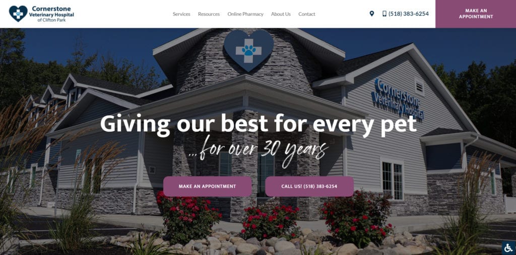
Their hospital is featured prominently in the hero. With such a beautiful location, we think pet owners will be well and truly wowed when they land on the homepage. People want to be associated with quality care, and this first glimpse definitely gives the impression of quality.
Additionally, we love the use of color to help the calls to action stand out, so they draw the eye to the online appointment request and click-to-call features. What’s more, the order of the navigation elements at the top puts the practice’s services first, which supports a user journey that gives pet owners the information they’re looking for, which in turn drives the behavior the practice is looking for–new clients and high-value appointments.
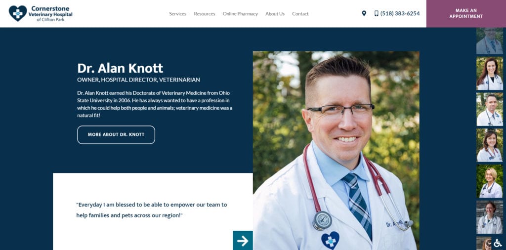
We really love the unique “meet our vets” section, too, which introduces pet owners to each of Cornerstone’s veterinarians using elegant functionality that really elevates the user’s perception of the brand. As the second most popular page on a veterinary website, the “meet our team” page having this much dedicated real estate on the homepage is a smart choice.
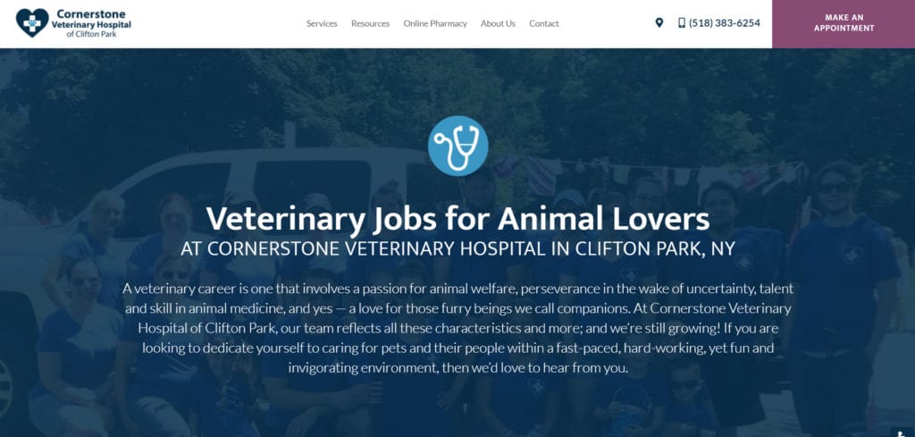
One last feature of Cornerstone’s website we want to point out is the employment opportunities page. Hiring is a hot topic for veterinarians right now, so having a page dedicated to current positions, company culture, and what to expect is very important.
Wrigleyville Veterinary Center
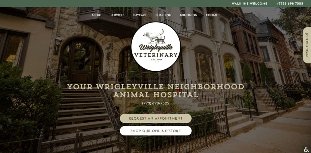
Wrigleyville Veterinary Center’s website has a classic feel that gives viewers an immediate sense of who they are and where they’re located. The hero image shows a line of beautiful homes in the Wrigleyville neighborhood. As you scroll down, we also like the subtle touch of the bricks and ivy that pay homage to Wrigley Field, to make the site even more personalized.
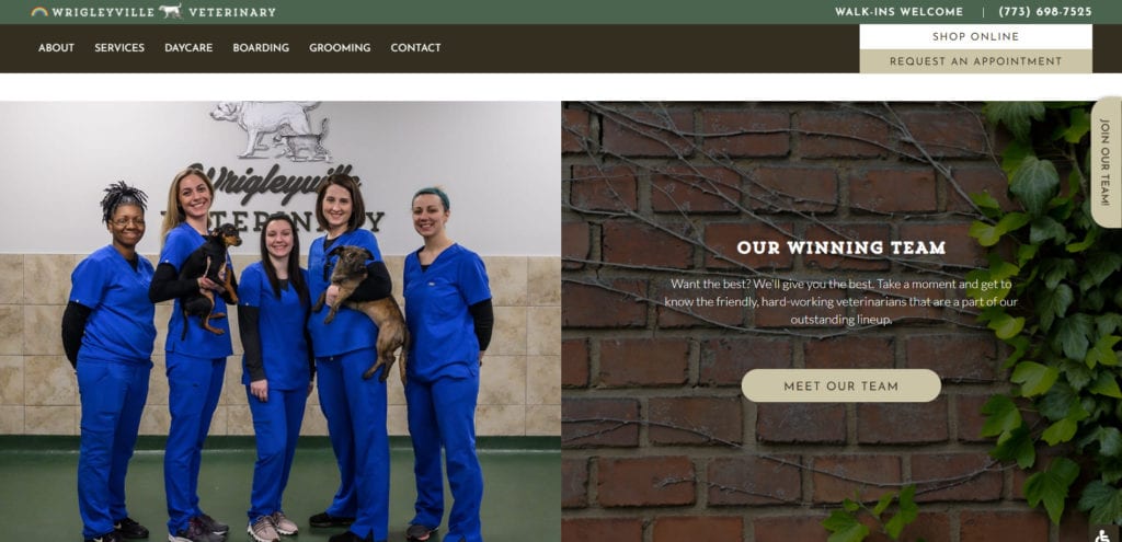
We like how easy it is to find the request an appointment and online store buttons right off the bat, which caters to both new clients and returning clients. We also appreciate the breakdown of practice hours and doctor hours, which is easy to digest and provides pet owners with the information they need to schedule their appointments.
The Google reviews widget just above the footer of the homepage is a great feature for promoting the practice, building trust, and lending credibility to the level of care provided so that pet owners trying to make a decision can feel a little more confident about choosing Wrigleyville for their pets’ needs.
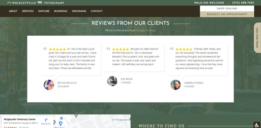
There is also a page for filling out hospital forms online, which allows pet owners to complete forms at their own convenience instead of having to spend time in the lobby doing paperwork. This also streamlines the form process for the hospital staff, giving them more time to focus on their patients and clients. Another notable feature we like is that their boarding, daycare, and grooming pages are separate in the navigation bar. This makes each service easy to find, and also promotes these services as something special at the practice, and something not widely offered at other practices in the area.
One last but no less important feature is the review us page. It includes a link to Wrigleyville’s Google reviews page, so clients can easily view more reviews or leave a review of their own. This is a helpful tool for increasing reviews and building a better reputation online.
Bees Ferry Veterinary Hospital
Less can most definitely be more, as demonstrated by Bees Ferry Veterinary Hospital. We really like the use of clean lines and simple navigation to give pet owners an easy way to find what they’re looking for on the veterinary website. This is supported by good use of contrasting colors to draw attention to the appointment buttons.
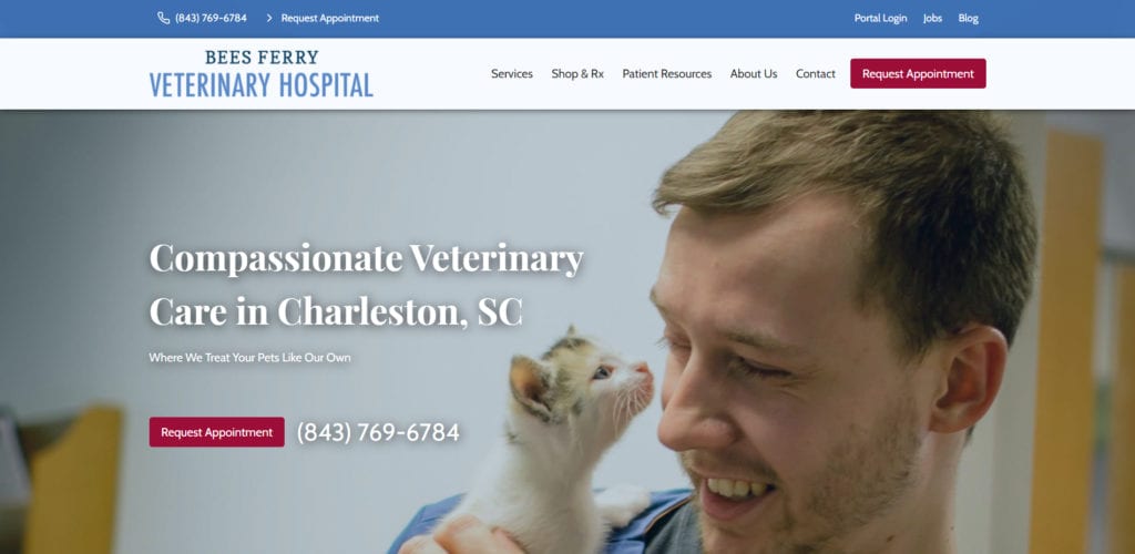
We also love the use of the services drop-down to include all their major services, which each have their own dedicated page. This allows each page to be optimized more effectively for search engines, versus having just one page that lists all the services together.
Another feature we appreciate on this website is the use of quick links on the homepage to lead pet owners to the “meet the team” page, which is the second most-visited page on a veterinary website.
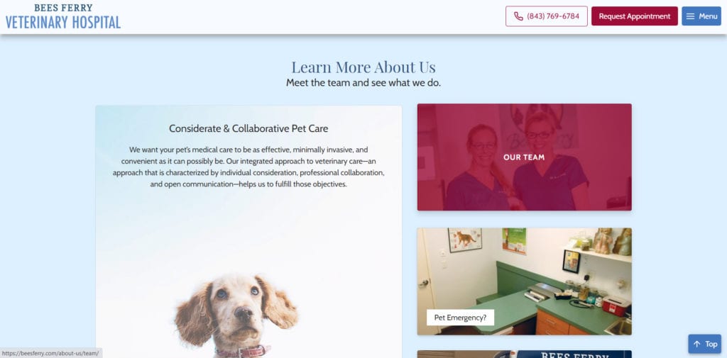
Bees Ferry’s use of testimonials is a great way to build trust with pet owners, and we like that the testimonial is positioned close to a call out about their AAHA certification–another big trust-builder!
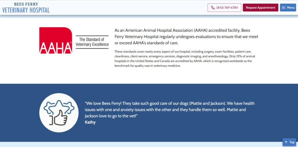
Under patient resources, we like that the first link show in the drop-down is called “your first visit.” This is going to attract the attention of new clients. Setting expectations and giving pet owners a view into what to expect is a smart move; Bees Ferry is putting themselves in their clients’ shoes and delivering information that will put them at ease–and make them more likely to choose Bees Ferry Veterinary Hospital for their pets’ needs.
Coyne Veterinary Center – Westfield, IN
The moment you land on Coyne’s homepage, you’re immediately treated to a click-to-call button, directions, and a beautiful image of their building. In the header, their phone number stands out, and their services drop-down features not just services, but their wellness plans, too, so pet owners are sure to see them.
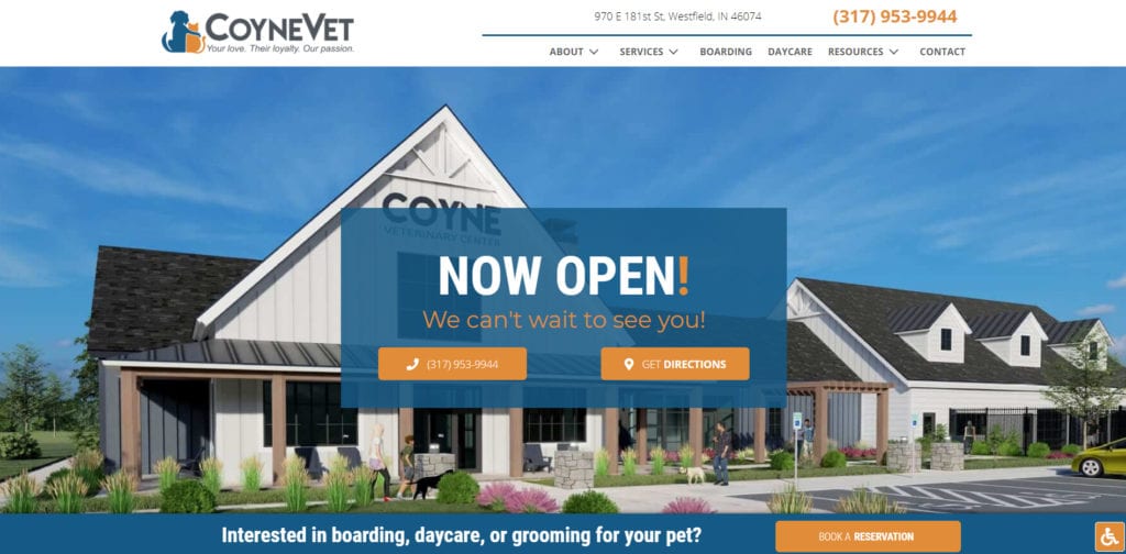
Coyne’s veterinary website combines strong design with high functionality that gets results. Everything featured on the homepage is customized to who Coyne is as a practice–original photos and design, and copywriting to match their culture. All of their main revenue streams are accounted for on their homepage, from the click-to-call button in the upper right of the header and in the hero, to mention of their extended hours, weekend availability, and no appointment being necessary.
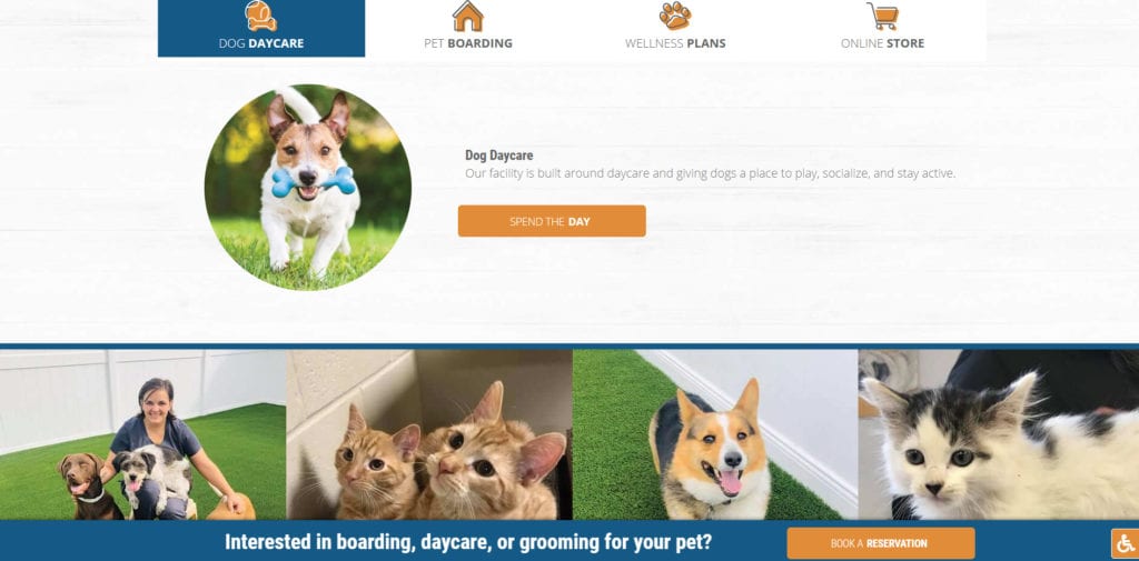
A homepage should stop a potential new client in their tracks and convert them to take action, and Coyne’s homepage does just that.
We love the Coyne website’s clean design and consistent, on-brand color scheme, and quick links that invite pet owners to find out more. Boarding and daycare are huge services for Coyne, so they’ve wisely had their boarding and daycare page links separated out in the navigation bar to make them easier to find. Oh, and we absolutely love the “book a reservation” call out that sticks to the bottom of the page as you scroll.
Boughton Square Animal Clinic
Our reasons for nominating Boughton Square Animal Clinic are similar to our reasons for choosing Coyne. We love the use of colors, the prominent and easy-to-find calls to action, a streamlined navigation bar…and custom photos and video! Done right, video can be a major asset for your veterinary website, especially if it features members of your team in action, caring for pets. This is a fantastic way for you and your team to build trust with pet owners and make an amazing first impression. You want people to be able to envision themselves as your client.
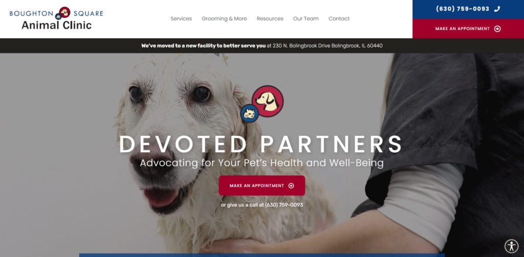
Boughton Square hits all the right notes–it leads pet owners to begin the new client process with a new client information link, has a feature linking to the “meet our team” page, and has tons of quick links to all their services. The website also makes it easy for pet owners to fill out online forms, access their pet’s records, see customer reviews, and even request prescription refills.
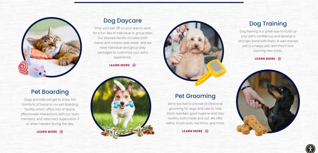
Since this website has gone live, Boughton Square’s new clients have doubled–in just the first month alone! Not bad.
Avian Exotic Animal Clinic of Indianapolis
One of the first things that struck us about Avian Exotic Animal Clinic of Indianapolis when landing on their website was their amazing video showing the animals they serve. It’s a simple but very eye-catching element, and really shows how the clinic’s patients are in good hands, figuratively and literally! It demonstrates their dedication to, and affection for, their diverse patients. Additionally, the variety of animals shown in the video sparks curiosity about their services and capabilities.
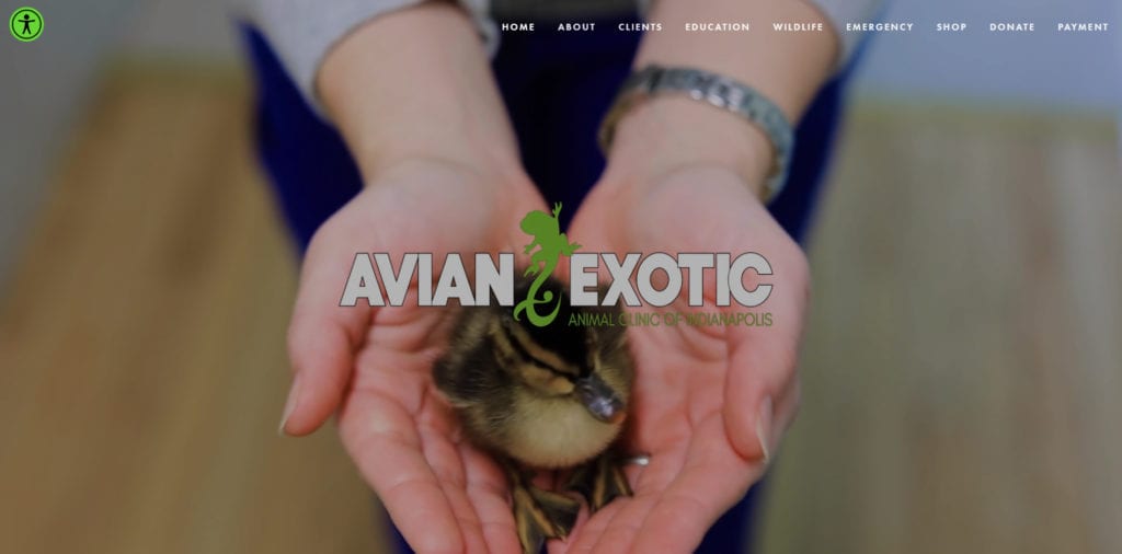
In addition to the video in the hero, their veterinary website also features an introductory video below the fold. It’s another great example of using video to feature your practice as it really is, showing your team members at work and your patients in the process of being cared for.
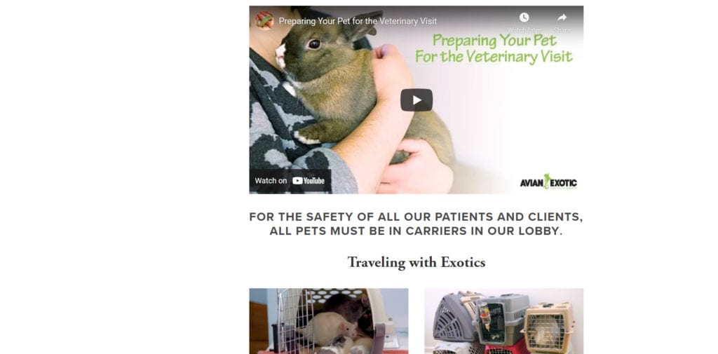
This website is somewhat unique compared to others featured here simply because it emphasizes imagery and video to a much greater extent. It does not place as much emphasis on services, but it does offer helpful client resources, including new client and patient forms, information about what to expect at your visit, and more.
Want to See More of Our Veterinary Website Designs?
We’d love to show you what we can do for your website–and your practice. Check out our website portfolio for more of our work, and contact us at (800) 493-9003 for a free digital analysis of your current website!
