
For many of us, we’re raised to believe that having more choices in life is always a good thing. And in some areas, it’s great to have lots of choices. But there is a dark side to this, and it’s called the paradox of choice. This issue has become increasingly apparent with the rise of the internet and e-commerce. With virtually limitless choices in food, clothing, electronics, music, movies, and more, we begin to experience some unintended negative effects from having so much to choose from.
So, what exactly is the paradox of choice, and what does it have to do with your veterinary website?
Understanding the Paradox of Choice
We usually associate more choices with more freedom and satisfaction, but this isn’t always the case. Having an abundance of choices means you have to make more effort to choose, and this can be stressful. This stress leads to feeling overwhelmed, and being less and less certain about which choice is actually the best one.
Why Having More Options on Your Website Can be Problematic
While some people might agonize over a decision but still walk away satisfied with their final choice, many might feel regret about their decision, and others might avoid making a choice altogether.
When someone lands on your website, you want them to make certain decisions as they navigate around. But your website design could be deterring people from going further and carrying out the actions you want, or prompting them to click off your site completely.
For many vet practices, it at first seems reasonable to provide website users with abundant options, instead of few options. Yet, while your intent may be to increase conversions and get more pets and people in the door, your website design could be having the opposite effect.
Reasons Why Less is More
It sounds cliché, but less really is more in the context of website design, especially if you don’t want the paradox of choice to rear its ugly head and make people indecisive while they’re browsing your site.
Here’s why it’s better to provide a limited number of clickable options for your website visitors:
People Can Navigate Your Site Quickly and Easily
A streamlined, organized header and navigation bar are key because they guide the viewer to where they need to go. Instead of having to hunt for a page or button, the viewer will have what they need right where they expect it to be.
A major factor in quality website design is understanding how the human eye tracks across a page, and designing the page based on that understanding. This results in a much more satisfying experience for the user and helps them find the information they need, or carry out a certain action.
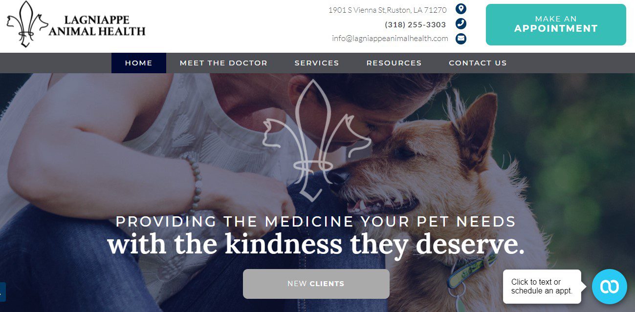
Lagniappe Animal Health has 4 items in its navigation bar (not including "Home"). The appointment button is easy to see in the upper right.
Your Website Will Perform Better
There are a lot of things that contribute to website performance, including calls made, forms filled out, and appointments scheduled. Your website is a great tool for eliciting desired actions and ramping up appointments, new patient numbers, and more.
When the header and pages are clean, organized, and have prominent, eye-catching calls-to-action, more people will be able to carry out actions on your website. This will lead to more conversions, more calls, and more appointments for your vet practice.
Your Website Will Look Much, Much Better
When your header and navigation bar are pared down to the essentials and have attention-grabbing calls-to-action, it will make your website look tidy and attractive. A minimalist design is more pleasing to look at and more helpful to the end user.
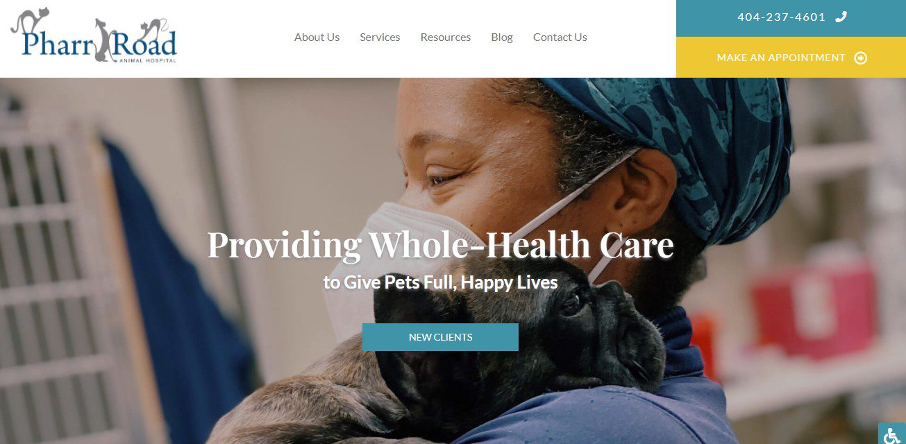
In addition to the phone number and appointment buttons, which are both prominent in the upper-right-hand corner, there is also a prominent New Clients button, which leads to Pharr Road's new client form.
Having Fewer Buttons and Links Makes Designing Your Website Easier
Asking a web design team to throw in lots of buttons, tabs, and links can slow down the website building process. Too many elements can create loading problems, interfere with other aspects of the site, and force designers and developers to find workarounds to fit everything you want into the layout.
A simple layout containing the most essential elements and little else is easier to design and build, and will be much more functional in the end.
What are the Best Practices for Creating a Great Website Experience?
You deserve a website that benefits your clients and your practice in equal measure. A few best practices for ensuring a good user experience include:
- Having as few call-to-action buttons as possible in your header. We typically recommend just one, such as “make an appointment” or “call now,” but it also depends on what your needs are
- Placing call-to-action elements in prominent places on the site and making them brightly colored so they stand out
- Reviewing your user data to see if any pages aren’t getting the traffic they should; your website might not be making it clear to people where they need to go
- Making your navigation bar the primary tool that people use to explore your website; we recommend breaking it up into these 3 key dropdowns:
- About – Pages that talk about your team, your practice, and career opportunities should fall under this category.
- Services – All of the pages that talk about your practice’s services should be organized under this tab.
- Resources – Online appointment forms, payment forms, online stores, and more should go under Resources.
Help Your Clients Avoid the Paradox of Choice
The paradox of choice is a dilemma people run into when they’re faced with too many options and have to work harder to make a choice. If there are multiple calls-to-action in your header and 10 items in the navigation bar, will the person who lands on your website know what to do?
Take a look at your current veterinary website and ask yourself this: Can I navigate through the site easily? Does it look too busy? Does it take a minute for me to find what I’m looking for? If you can say yes to any of these (or all of them), then it’s time to clean house. Get InTouch by calling (800) 493-9003 to see how we can streamline your website and get it performing at the highest possible level.