
In today’s rapidly evolving digital world, having a mobile-friendly website is an absolute necessity, especially for veterinary practices like yours. Here at InTouch, we understand the veterinary industry and the unique needs of veterinary practices. For over 25 years, we have helped them expand their growth by competing and succeeding in the digital marketplace. We cannot emphasize enough the importance of having a mobile-responsive website that helps your practice connect with more pet parents.
If you’re a little new to the concept of “mobile-friendly,” we encourage you to read on—we go into detail about what mobile-friendly entails for your website and why it’s valuable to your practice.

The Rise of Mobile Internet Usage
What gave rise to the mobile-friendly website?
Understanding the Shift
The digital landscape has witnessed a seismic shift from desktop to mobile internet usage. This change is not just a trend but a whole new norm, with most pet parents using smartphones to seek out veterinary services and information. A mobile-friendly website makes your practice more accessible and appealing to this growing demographic.
A Key Statistic
Studies show that over 60% of internet access is done via smartphones. This statistic alone is a compelling reason for your veterinary practice to optimize its website for mobile devices. Failing to adapt to this trend can result in missing out on a significant portion of new clientele.
The Importance of a Mobile-Responsive Website Design
A website that’s responsive on mobile is designed with specific goals in mind.
User Experience and Engagement
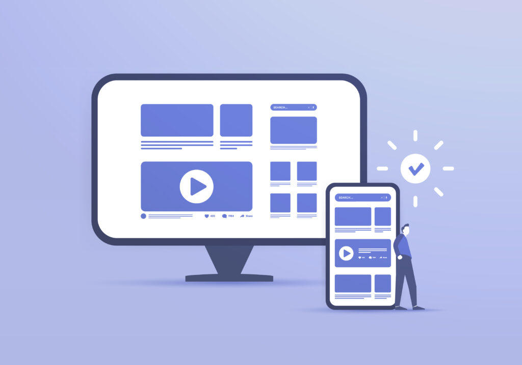
First, a mobile-friendly website is all about providing a seamless user experience. It ensures that your website is able to adapt to various screen sizes, load efficiently, and present information in a readable format on smaller screens. This adaptability is key to maintaining engagement and building trust with pet parents.
Impact on User Behavior
A website that isn’t mobile-friendly often experiences higher bounce rates and lower user engagement. On the other hand, a mobile-responsive website can lead to increased time spent on your site, higher interaction rates, and, ultimately, more appointments booked. It’s about making your website not just accessible, but also enjoyable for pet parents to use.
SEO Advantages of a Mobile-Friendly Website
A mobile-friendly website is easier and more fun to use, but it also benefits your SEO.
Improved Search Engine Rankings
Mobile-friendliness is a critical ranking factor for Google and other search engines. A mobile-optimized website can elevate your practice’s online visibility, making it easier for potential clients to discover your services.
Local SEO Benefits
For veterinary practices, local visibility is crucial. A mobile-friendly website significantly boosts local SEO. This is particularly important as most pet parents search for veterinary services within their local area, often via mobile devices, using key search terms like “veterinarian near me,” “animal hospital near me,” and “locally owned vet near me.”

Content Optimization for Mobile
Your website’s content can also be optimized for mobile devices for easier skimming, so pet parents can find the information they need more quickly.
Readable and Engaging Content
The content on your website should certainly be informative, but it also needs to be mobile-friendly. This means short paragraphs, bullet points, and engaging headers to catch the eye. InTouch specializes in creating content that resonates with pet parents and is optimized for mobile viewing.
Visual Elements
Images and videos play a crucial role in engaging visitors. We ensure that these visual elements are optimized for fast loading and proper display on mobile devices, enhancing the overall user experience.
Technical Aspects of a Mobile-Friendly Website
So, a mobile-friendly website looks good and provides information pet parents are looking for in easy-to-find, bite-sized sections. But that’s not all!
Fast Loading Speed
Mobile users expect quick access to information (as do we all!). InTouch focuses on optimizing website speed to ensure your website loads quickly on all mobile devices, reducing the chance of potential clients navigating away due to slow response times. Trust us, this happens a lot–but we won’t let it happen to you.
Easy Navigation
The design of your mobile website should facilitate easy navigation. Simple, clear menus and touch-friendly buttons are essential. Our website designs make intuitive navigation a priority to ensure pet parents can find what they need with minimal effort.

Get a Mobile-Friendly Website with the Help of Experts
InTouch offers customized, up-to-date solutions to keep veterinary practices like yours competitive in the digital space. Standing out is important, but ensuring a seamless experience for pet parents interacting with your website is critical to your growth. We always stay on top of the latest veterinary and marketing industry trends to provide our clients with the best websites out there—websites that enhance user experience, boost SEO and help you hit all your business goals.
Want to navigate the digital landscape with confidence? Partner with InTouch by calling (800) 493-9003 and we’ll set you on the path to success.